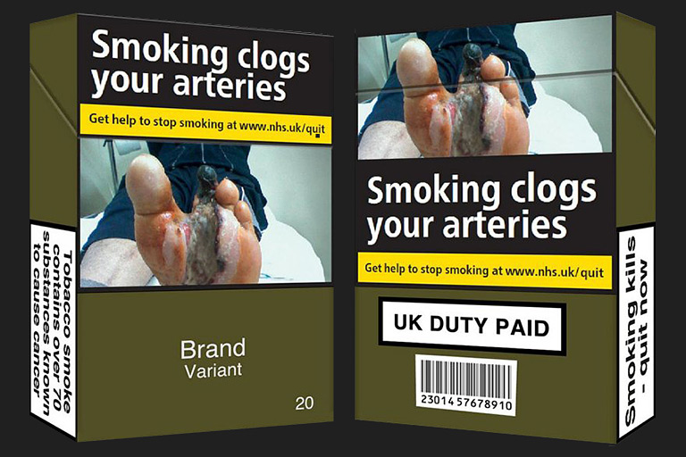
In May 2016, the U.K. introduced a new law for cigarette packaging which dictates the design up to the colour, typeface, and image. All cigarette packages have the standard design which was first introduced in Australia in 2012. The packages will be printed in Pantone 448, a colour which came out of market research as the world’s ugliest colour. Logos or branding are no longer allowed, only the brand name in Pantone Cool Grey 2, typeset in Helvetica. The only distinctive element will be the health warnings with photographs that cover 60% of the pack. Research showed that cigarette package designs mislead people about the difference is health risk per brand, for instance people assume light-coloured packages are healthier than dark-coloured, which is why it was decided all cigarette packaging should look the same. The same designs will be introduced in France and Ireland as well.